Amber-Tozer

Photo Credit: Ahna Tessler

Here at Fetchland we love to meet cool people, including the hilarious Amber Tozer. She’s a stand-up comic and writer with a Twitter following of more than fifty five thousand. Her tweets have been featured on Ellen, Huffington Post, Playboy, Mandatory.com, and many others. Amber’s also the author of a fantastic new book that had us peeing our pants laughing. All of her stories keep us enthralled while maintaining a tone of rollicking good fun. Her memoir does this exceptionally well AND, yes, she even drew the pictures. Sober Stick Figure recounts her story with fresh comedic insight that holds nothing back, not even the pee…

Fetch: Fetchland.com is a website where a lot of the readers are into the game Magic the Gathering. When you first came to New York City you worked at THE magic website thedojo.com. Is this the startup you talk about working at in the book?

Amber: Due to legal reasons I can not name real names of companies, but I will say this – that startup was “the online destination for gamers” and Magic the Gathering players loved that site. Was it thedojo.com? Maybe!

Fetch: We understand that this book is essentially understood to be about your experience with alcoholism and you giving the reader a personal road map to recovery. But what’s it really about for you? What do you want to give your readers with this story?

Amber: I love writing funny things about dark thoughts and situations and I’m obsessed with transformation and enlightenment. So, for me, spending time in hell, knee deep in alcoholism, and finding a way out and writing about it in a way that I think is funny – is what it’s about. For the reader, I hope they get what I have been given by other people’s stories of recovery – a better understand of addiction and a little hope. I also hope they laugh.

Fetch: Speaking of gifts, what’s a favorite experience you had in giving your book to someone or signing one for a fan?

Amber: Ha. Well, this very nice and enthusiastic guy named Chris, was at my book signing in NYC. We are friends on Facebook but we have never met before. He showed up and bought a bunch of books and then told me to go outside because he had something for me in his car. I thought, “He’s gonna murder me. Oh well, I’ve had a nice run.” So I went outside and his SUV was like a big chalkboard – the paint was chalkboard material – and he drew one of my stick figure drawings ON HIS CAR. It was nuts! He said he just really liked my book so he did that. That was my favorite experience. Oh, and my friend Lauren brought her little boy to a signing and he was carrying around my book around the bookstore and it was cute and made me happy.

Fetch: The world is reading your book! Tell us about the cities you’re visiting on your book tour and what silly stuff’s happening in each one.

In LA I had a launch party at Cinefamily. The co-host got really drunk and then I read about sobriety.

In Pueblo, CO I did a book signing at my mom’s restaurant. It was weird because a lot of my family members were there and I was reading about my dysfunctional family TO my dysfunctional family.

In Denver, CO I did a signing at Tattered Cover Bookstore and nothing weird happened but it was magical! I loved the vibe and the people at that place! My friends Timmi Lasley and Nathun Lund open up the show and they drew stick figures for their stories and it was really funny.

In NYC I did a signing at Powerhouse Arena. This was incredible. My friend Sarah Elizabeth Greer opened up the show with a story about stalking Edie Falco and she gave everyone in the audience pennies and told them to throw them in water for good luck. Jacqueline Novak read from her book HOW TO WEEP IN PUBLIC and it was so good. Oh, and my agent, the guy who changed my life, Peter Steinberg was there and brought a bunch of people from work. Fun times!

I’m in London now. Sober Stick Figure is published in the UK! I’m out here promoting it and will be on BBC Breakfast morning show talking about it! I just got here a few hours ago, so nothing weird has happened yet – although I did see a guy scratch his balls for about 5 minutes straight at the airport. He was sooo into it I couldn’t believe it.

Fetch: Some of the greatest stuff in your book comes from how you put yourself out there and let it all hang out. Was it a challenge to be so vulnerable and tell us about your sexual escapades in print? Were any particularly hard to talk about?

Amber: Yes, the sex stuff was a little hard to write about. Especially opening up about my bisexual benders. I’m ok with writing jokes about sex, but writing the truth about my sexual escapades was hard only because I knew my family would be reading it. When anyone else writes about their sex life in detail, I think, “Good for them.” But, I don’t like doing that. Catholicism ruined me – and there are so many perverts in the Catholic church. My guilt doesn’t make sense!

Fetch: Are you planning on talking about this whole book experience in your next stage of stand up comedy? What are some jokes that’ve already come up?

Amber: Well, one of my family members gave me a bad review online and I called and yelled at her and it is now my favorite story to tell. It’s just really ridiculous and funny. So maybe when I hit the stage again I’ll tell that story. I don’t do much stand up anymore but I want to do a solo-show and incorporate a lot of the stuff from the book into it.

Fetch: A few years ago you made us laugh our asses off with a riff on Beyonce’s song, Irreplaceable. We loved it so much that whenever that song comes up it makes us think of how incredibly funny you are. Is there a more current song that inspires you like that one did? Or in another way?

Amber: Haha. “To the left to the left!” That song is so funny. I really love Justin Bieber’s song Love Yourself and that part where he goes, “My mama don’t like you and she likes everyone.” It’s such a sick burn! “Even my friendly mom doesn’t like you!” I don’t really riff too much on it but I honestly laugh every time I hear it because if someone ever told me that it might make think about my bad behavior.

Fetch: Got any tips for first time authors who have a story to tell? Anybody can have a blog… but you’re on the actual bookshelves, baby!

Amber: Write everyday. Share your work on social media. Write what you want. Write what interests you. Don’t think too much when you’re writing, you can do that when you’re editing. Build a body of work so if you are approached by someone who can give you a job you have something to show them. Never give up.

Random superlatives we asked Amber to list:

Best SNL cast member – Gilda Radner

Coolest sneakers -Saucony Original Trainers

Crucial condiment – Sriracha

Black & white movie you love – Days of Wine and Roses

Board game that’s never boring -Scattergories

Go to late night snack
– A bowl grapes, yogurt, and sunflower seeds or an entire bag of Veggie sticks

Thanks to Amber for taking the time to answer our questions and always making us laugh. We love your advice to writers and can’t wait to see that solo show you talked about doing next. It’s certain to be hysterical! Check out Amber’s clever and uproarious book Sober Stick Figure (click the link to buy it right now, bro) and her hilarious tweets at @AmberTozer.

– Katherine Recap

Batman V Superman: Dawn of Justice

Like the title says, this is a post about things I didn’t like about Batman V Superman: Dawn of Justice. Like anything I do, say, or write about comics and comics-related media it will be almost annoyingly detailed; TLDR: spoilers Spoilers SPOILERS. Consider yourself warned.

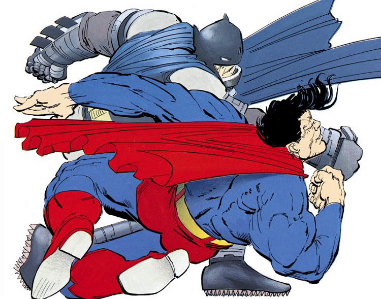
1. The violence was genuinely (and needlessly) over-the-top

batmanvsuperman1a

Adapted work is its own thing.

That’s one of the things die-hard superfans sometimes miss. There have already been innumerable comics about Batman, Superman, and Wonder Woman. The fact that this movie got made is its own thing, the same way The Lord of the Rings films were their on thing, or the Game of Thrones HBO show is its own thing. The original work, the source material, is in a sense limited (and targeted to a limited audience)… Bringing the page to small or big screens is at once a compliment and a compromise.

A compliment in that these characters (that some of us die-hard superfans love) get to be exposed to more people, in more consumable contexts… But compromise because expectations for movies and tv shows and what the average viewer will like can be very different. So I get the idea that you want to modernize Superman (or Batman). I get when you make a movie that costs hundreds of millions of dollars you’re going to want to have a lot of explosions. You might not be willing to dwell on the specific ethics of these characters that have been developing for seventy years for very long in a film that has to cram a lot of stuff in; cutting such a perspective into a single sound byte might make sense as a filmmaking choice.

BUT!

… At some point adapting, “modernizing”, and reducing down too much can betray the essence of a character; what makes the character [special], or worth a movie (or a movie franchise).

Case in point:

In the opening action sequence a terrorist has Lois Lane at gunpoint. Superman is staring him down. Superman can do a lot of different things here (this is a movie, by the way, that acknowledges the work of John Byrne in the credits). He can melt the terrorist’s gun with heat vision. He can fly so fast that he can stop the hammer of the gun on the way down. Even if the gun is to Lois’s temple he can move so quickly he can catch the bullet before it hits her. All of these things, by the by, are well within the abilities Superman shows in this movie.

Zach Snyder has Superman torpedo into the terrorist and slam him through the wall behind him. Not only is this way more risky than anything I suggested above… It would almost necessarily result in the terrorist being liquefied. There is just no reason for it… Though it does set the tone for the next two hours and their nonstop over-the-top violence.

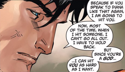
2. Superman’s complete lack of conscience or consequences

batmanvsuperman2

Superman has many super powers… Heat vision, super strength, resistance to injury, lightning speed to the point of interplanetary flight. That last one has, over the years and different writers’ interpretations led to super-learning and super-strategy. Superman’s brain just works super fast; he is a super scientist sometimes, a chess master, a prize winning writer.

The difference between Superman and Batman is that Superman is always tempered by his humble roots and moral grounding.

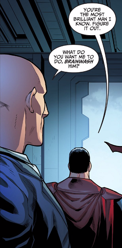
So why in the world (beyond the fact that he is more than willing to fly humans through brick walls) would he trade Batman’s life for Martha Kent’s? We know why Batman wants to fight Superman… But at the climax of the film, Superman consents to Lex Luthor that he will trade the head of the Batman for his own mother’s life.

Let’s think about this for a moment… If Superman wins, Batman dies; if Superman doesn’t win (or doesn’t fight), Martha dies. It’s a life for a life in either case… But in one Superman isn’t the murderer himself. Where is his moral compass? What would Martha have wanted for him? In the universe set up by Man of Steel Clark let his father die for less.

Besides which, super-brain for a second, if Lex knows who his mom is and can blackmail him this one time, what is to stop him from doing the same thing the next time?

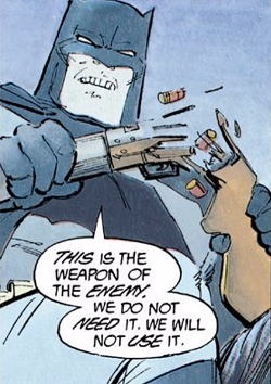
3. Batman seemed to have no problems killing people… With guns

batmanvsuperman3

In comics and most related media, both Batman and Superman have gone to extraordinary lengths to preserve human life, even of their archenemies. A lengthy plot line in the Justice League cartoon is about Bruce thinking about killing the Joker (but not) when Clark thinks about killing Luthor and going down a dark path. Only the alternate-universe-death of Lois Lane is ever enough to have Superman do stuff like punch out the Joker’s heart; less than that and he will turn the other cheek. It was a huge deal at the end of Final Crisis for Batman to use a gun to beat Darkseid; but Grant Morrison’s use of Batman, the gun, and the conclusion of that story was perfect poetry. And Darkseid is a god.

In Batman V Superman: Dawn of Justice Bruce strafes cars and trucks from his Bat-Wing. I guess the guys in the aforementioned cars and / or trucks could conceivably have walked away… But those were some big explosions. Bruce didn’t blink an eye. In the pivotal scene where Batman saves Martha Kent from the KGBeast (armed with a flamethrower) he, like Clark and the unnamed terrorist in the opening sequence, could have done a lot of different things. He chose to shoot the gas tank with a gun (blowing it up and lighting up the kidnapper) tackling Martha to the ground under a presumably flame retardant cape. It wasn’t just un-Batman; it was common.

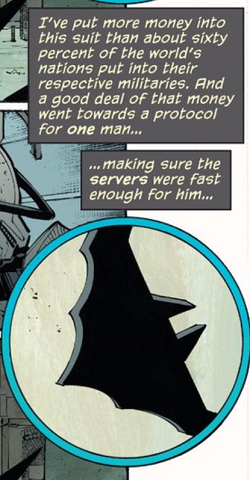
4. Batman had no control of his emotions

batmanvsuperman4

Bruce has Clark by the throat, kryptonite lance etching his cheek, getting ready to monologue.

Lois bursts in and stops the scene.

Bruce throws down the kryptonite lance and runs off to save Mrs. Kent.

Bruce throws down the kryptonite lance and what now?

He spent the entire first half of the movie doing nothing but trying to get the kryptonite and then just discards it? Forget about the fact that it would be an important plot element later… Why would the most competent man in the world possibly do that? HE SPENT THE ENTIRE FIRST HALF OF THE MOVIE DOING NOTHING BUT TRYING TO GET THE KRYPTONITE.

The entire plot of the video game Injustice: Gods Among Us is Bruce getting access to kryptonite. This is not just a smart guy acting stupid, this is the smartest guy acting extraordinarily emotional instead of rational. In the final scene between Batman and Luthor, Bruce pulls off the first half of “something super cool in a movie”, sneaking into Luthor’s jail cell when the lights go down. He is going to brand Lex with the bat to mark him in prison. It’s going to be awesome. Lex starts ranting, Bruce grunts loudly, punches the wall, and leaves. It’s inexplicable. It’s un-Batman.

5. Wonder Woman’s wildly inconsistent defensive capabilities

batmanvsuperman5a

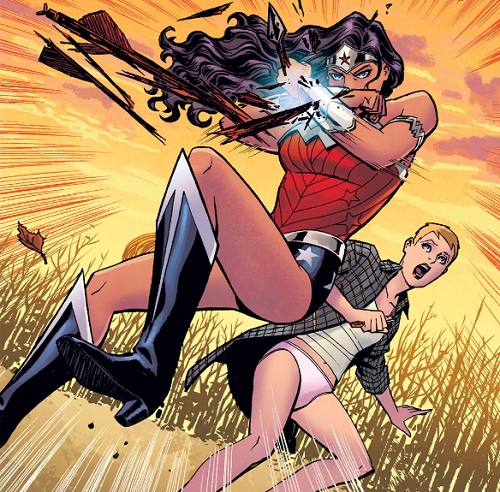
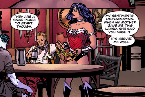
After two hours of teasing us in evening gowns Gal Gadot makes her Amazonian debut jumping in front of Doomsday, bracelets defending a hapless Batman from certain eye beam. Cool. Aegis bracelets, Hephaestus sword and shield, Magic… check, check, check. Cool.

So Wonder Woman is tough, ageless, etc. But she does seem to need her bracelets or shield to defend her from superhuman attack. We see them light up when she is blocking heat vision, or channel explosive bursts of energy. So tell me how this defends her from an omni-directional nuclear-esque explosion, or even just construction debris?

Doomsday is shown knocking down multiple buildings in every direction with his energy attacks. Batman has to take cover. Wonder Woman can’t actually block all of that with either bracelets or shield. But we just saw that she has to use the bracelets and / or shield, didn’t we? She’s super… But she’s not Superman. If the building she is in is getting incinerated I totally get that she would have perfectly preserved wrists, but the rest of her shouldn’t logically be Maxim cover-ready for the next frame.

6. For that matter, Wonder Woman’s wildly inconsistent offensive capabilities

batmanvsuperman5

We know Superman killed Zod by snapping his neck in Man of Steel. Wonder Woman cuts off Doomsday’s hand with her magic sword. She breaks his armor on multiple occasions, hamstringing him, as they melee… She’s clearly well trained and agile enough to land cuts without getting hit back. Why doesn’t Wonder Woman just behead Doomsday? She could: WE JUST SAW HER CUT OFF HIS HAND.

7. For that matter, what exactly can kill Superman (or Zod / Doomsday)?

batmanvsuperman7

Let me get this right: A nuclear explosion not only doesn’t kill Superman, it doesn’t damage his uniform. Being stabbed by non-kryptonite, though, kills him to death? Keep in mind he was not stabbed by kryptonite. He was just near kryptonite. By this logic, when Batman poisoned Superman MULTIPLE TIMES with direct hits with his kryptonite rifle, shouldn’t he have been weak enough to die by all the bathroom sinks, multiple-story falls, and building breaking blows that Batman levied on him? Any of those — which included multiple head and neck blows while actually choking on kryptonite fumes — should have been more lethal than a random stab wound that happened to occur while he was merely near kryptonite.

8. Anything and everything having to do with Lex Luthor

batmanvsuperman8

Lex is the smartest man in the world, who by the end of the film commands the sum total of Kryptonian scientific knowledge between his ears. He outsmarts Batman and figures out Superman’s secret identity. What is his motivation? Why would he make Doomsday with apparently no fetters or fallback plan? Just to kill Superman? Lex didn’t actually have a kryptonite weapon. Would Doomsday have stopped nicely after killing Superman? Doomsday’s first move was busting up Lex’s own office building! Why did Lex kill his own assistant in Washington? (Mercy is one of the few characters Lex ever seems to have a genuine respectful relationship with in comics and cartoons.) Why in the world is it the end of the plot line to put him in prison. Does he suddenly no longer know who Batman and Superman are in street clothes if you put him in prison? We know he can stop Batman from branding him with a rant… What if he starts ranting about billionaire Bruce Wayne?

Not that I didn’t like lots of things about Batman V Superman: Dawn of Justice. I teared up early when Bruce Wayne in his Gucci vest rushed towards danger to save a little girl. I thought Wonder Woman was badass. But in an environment that includes movies like Deadpool, Guardians of the Galaxy, The Avengers, or X-Men: Days of Future Past we are simply no longer in a place and time where comics movies can be mindless and inexplicable. Comics movies can be brilliantly executed like Stardust, hilarious commentary like Kick-Ass, or just great movies (not just great “comics” movies) like Captain America: The Winter Solider.

Zach Snyder had a great opportunity on this one. Sadly, it could have been a lot better, for both superfans and regular-fans.

LOVE
MIKE

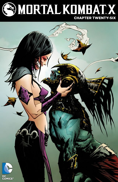
Mortal Kombat X #26

comiXology summary:
Mileena vs. Skarlet! Reiko vs. Kotal Kahn! The brawl for it all continues as a surprise new character joins the fray!

I’m a sucker.

I’m a sucker for a bunch of things.

I’m a sucker for a bunch of things in the same way that BDM has 15 or so movies in his “top 5” favorite movies.

Things I am a sucker for:

Juxtaposition – If you put unlike things together in an artful or internally-logical / consistent way, I will like it (or at least you will get points for it). Here we have a character that is 95% super sexy [and meant to be gazed on that way]… Trim figure, barely-there top, shiny leather pants… But, oh yeah, monster mouth. Ew. Gross. Yet…

Surprise! – I was always more of a Street Fighter guy as a kid than a Mortal Kombat guy, but I played some Mortal Kombat; sure. Back twenty or so years ago when these characters were first coming out, Mileena was more-or-less a sprite of 1-2 other ninja girls, except she had a sash over her mouth. The sash was — gasp — to cover up her gross monster mouth. This was only to be revealed via Special Move ™. Surprise! Now a couple of decades in, Mortal Kombat-consuming audiences know about her monster mouth and she is not even wearing any cover-up here. So the surprise is in the slavish depiction of her opposite number on the cover. He sees that she is a monster (not just some slim-if-deadly ninja doll). But he is still mesmerized, on his knees. Surprise!

Jae Lee – When I took an art class at age 17, on the first day the instructor gave us a questionnaire about what we wanted to learn / accomplish in that art class. I vividly remember writing some approximation of “to learn to draw like Jae Lee” on mine (which was probably horrifying to the instructor, who though American, changed both his first and last names to the French approximations, accent marks and all). I recounted that story to BDM some time in the ensuing twenty years and he remarked “I take it learning to draw feet was not high on your list” … Hmmm, awesome cover or no, Jae did not make with the feet here, did he?

This is a digital comics cover; and while I am not a regular consumer of Mortal Kombat X, my take is that it is the cover for both #26 and #27; it had me doing a double-take, which is saying something given it was a tiny icon on a browse page and not even a real magazine on a real newsstand. Like I said, I’m not the usual audience, but I not only clicked, but upon recognition of a style, I clicked and further clicked to confirm that it was in fact a Jae Lee… Up to and including writing up this piece.

From a style standpoint (and this might go back into the “juxtaposition” section) it really got me thinking about how Lee broadened his execution here. The Mileena figure on the left is pretty classic Lee. Sharp lines, very graphic use of blacks for outline, accent, and deep, opaque spaces that can be interpreted either as shadow or color (black). But on the right, the opposite character is finished in a very different way. Note the ink work on his headdress… That’s very “brush” rather than “pen”. Ditto on his musculature. Notice how she is all smooth and he is all feathery muscle-wise? While I would not go so far as to say the figures are from two different pieces, they seem quite differently-finished to me. I don’t know that that is a weakness (I think the piece overall is plenty striking and effective), I do think that it is pleasantly noggin-scratching for those of us who kind of stared at this cover for half an hour. Mayhap Lee is stretching his skills a little, in a way that most audiences might not even notice; he manages to do his usual thing while still channeling a mote of Alex Raymond (perhaps for future invocation).

Either way, looks cool.

LOVE
MIKE

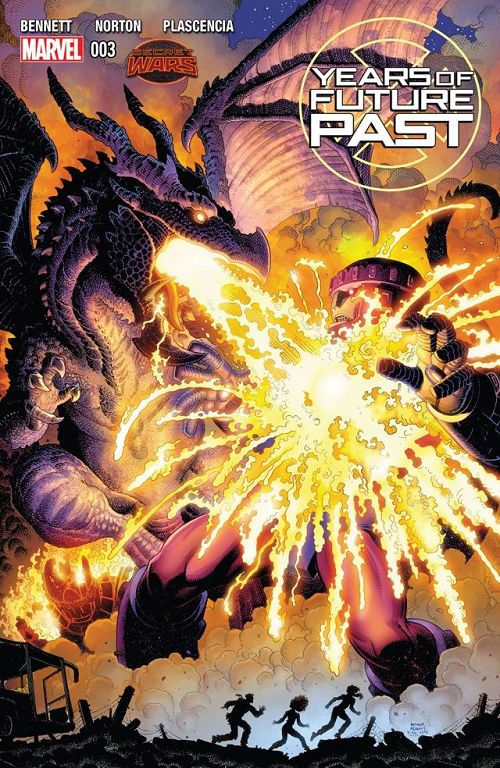
Years of Future Past #3

comiXology Summary:
Gouged up from its sanctuary, the mutants’ last defender clashes with Sentinels above the ruins of New York City! Kate Pryde and her family take refuge in a Coney Island madhouse, and find dark revelations at last!

Kind of a weird Superficial Saturdays on this one (yes, besides being published on, you know, a Sunday)…

Brian David-Marshall (bdm) and I were standing around together between rounds at Friday Night Magic last week; my first Friday Night Magic ever, if truth be told, and we were going over all the new comics on the shelves. I was making a note on how basically all the currently printed Marvel Comics are marked as “Battleworld” or “Secret Wars” in a storyline somewhat reminiscent of DC’s Crisis on Infinite Earths. We leafed through covers and pointed out the logos, and Brian noted how the current event is also resurrecting successful or at least iconic story lines of Marvel past, like Future Imperfect, Inferno, or the crossover concept of Secret Wars itself.

Which brought us to Years of Future Past #3.

“This cover is awesome! If anything is a Superficial Saturdays, this is,” ordered Brian. “I am not really into reading comics right now, but if anything was going to pull me from the gaming tables to the comics shelves it would be this cover.”

Let’s take a look at Years of Future Past #3 and check for some of the things Brian is talking about…

First of all, in the top-right corner, is a comic that is [something] about “Future Past”. You don’t need to be a die-hard comics reader to know that “Future Past” is a reference to an X-Men story featuring Sentinels because there was a great movie on the same topic last summer. But generally speaking, yes… Days of Future Past was a 1980s X-Men story that is very highly regarded; generally considered either #1 or #2 in the iconic Chris Claremont / John Byrne collaboration (depending on how much you like The Dark Phoenix Saga).

Interestingly Brian noted that he thought the cover was an Arthur Adams. It is in fact an Arthur Adams. Art Adams is one of those artists whose work is almost unmistakable once you’re any kind of familiar with it. I’d guess it has been twenty or even thirty years since Brian has read an Arthur Adams X-Men book… But he was still able to pick one off the stands from several paces. Art Adams is an interesting choice for cover artist here… Adams was one of the hottest, most hyped X-Men artists of the 1980s, but didn’t really contribute a huge number of issues or sustain a run on Uncanny X-Men in the same way that other giants of the era like Marc Silvestri, Jim Lee, or of course John Byrne did. Adams was mostly responsible (or co-responsible) for bringing Longshot into the X-Men family via Limited Series and a couple of annuals that constituted the Asgardian Wars (a de-powered Storm flirts with regaining her weather control powers by getting a Thor-esque hammer, stuff like that). Yet Adams is an iconic 1980s X-Men artist in the minds of many readers, and the Years of Future Past editors are keying in on that with their choice here.

“That is Lockheed burning down a Sentinel!”

Brian was quite excited about this last point. I am not actually sure that that is Lockheed, Kitty Pryde’s pet purple dragon, as it is a gigantic dragon and Lockheed can sit on your shoulder… But it certainly looks like a giant Lockheed! Days of Future Past was Kitty’s story, and Lockheed is Kitty’s dragon, at least. Lots of fanboy heart-tugging seeing a beloved, typically-little guy incinerating the symbol of Mutant oppression, especially on equal footing.

From an illustration standpoint, I can’t disagree with Brian’s assessment of “awesome”. Adams does a great job with foreground and background detail here, actually making the foreground characters less detailed, shadowed by the illumination of Lockheed’s fire breath. I am usually a “flat color > ‘computer’ coloring” [I know, I know, “everything” is computer coloring], but I am a sucker for making lights look super bright on a page, and the colorist did an amazing job making Adams’s line work appear like molten metal here. Absolutely A+ on that front. Moreover, the shadow / scales / light source detail on Lockheed himself shows tremendous attention to detail.

But most important was Brian’s assertion that he would walk over and pick up this comic if we hadn’t already been chatting about them. When you choose a cover artist, especially one that is different from a talented interior artist (like Mike Norton on this book), it has to be to get people to give your book a chance. This one passed that test with flying colors — purple and gold, to be exact.

LOVE
MIKE

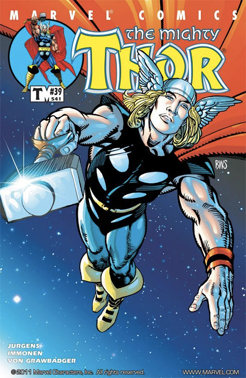
The Mighty Thor #39

ComiXology Summary:
While Thor and Jake have their wounds tended to by Asgardian healers, Odin and Balder discuss the fate of the Destroyer. Will Odin finally end the dark legacy of the Destroyer Armor?

Jake?

Odin?

Balder?

The Destroyer [Armor]?

I don’t know about you but I don’t see any of these cats or any of that jazz on this cover.

To me, this is a pretty non-specific cover that could have been slapped on any number of issues of The Mighty Thor… But just so happens to be on #39-slash-#541.

Non-specific or not — in terms of subject matter and execution — this cover is pretty specifically awesome, and showcases a lot of what makes Barry Windsor-Smith such a revered illustrator.

A lot of guys doing comics just want to do comics; they lack drawing fundamentals which they make up for (somewhat) with tons of lines, extra muscles, skimping on feet, and endless teeth. On the other hand you have an artist like Barry Windsor-Smith; a REAL ARTIST (all in caps) who happens to be putting a superhero on a piece of paper.

I find his decisions really thought provoking… Essentially no background; but a weird off-center figure layout. A mix of really fine lines around the thighs and boots with these thick, cartoon-y strokes around everywhere else. The ink quality looks really “wet” and confidently loose, without sacrificing an air of precision. Windsor-Smith cheats with the inks, though. To my mind there is little if any finishing differentiation between Thor’s skin, his leggings and his hammer / helmet. Now obviously his helmet is metal, but it is is Mjolnir that gets the more dramatic metallic lighting effect (funny, I “know” Mjolnir is Uru, but I usually “read” it as stone when looking at a Thor picture). Then we have these totally random horizontal slashes across the white circle-thing on Thor’s right pectoral (I’ve always read those as stylized metal discs on leather armor, which would make the particular execution of these slashes completely illogical).

The only things that get a different ink finishing quality are Thor’s wrist straps and boots (which are both “cloth”).

But I don’t care. This cover ultimately works, and I love how the line work comes out, differentiation or no (especially on Thor’s flowing golden locks). The visual figurative language here reads classic funnybook but Windsor-Smith elevates it with his Renaissance-influenced compositional capabilities. I generally find “blatantly obvious Photoshop filters coloring” garish but there is so much negative space (BWS feels no need to cover up bad form with endless speed lines and cross hatching) the colors work just fine; besides which, I doubt he colored it himself.

Finally — and this is a “fellow artist” thing that I wouldn’t expect most folks to pick up on, but one that I get a kick out of — note Barry Windsor-Smith’s signature, “BWS”. He signs in white ink right under Thor’s cape on the right side of the image. “BWS” has another meaning for comics illustrators… “black with stars”. As onetime comics editor BDM taught me during the first Comic Book Idol, “BWS” is shorthand for pencilers to indicate generic nighttime sky finishes to their inkers. Here BWS’s “BWS” is a tongue-in-cheek background instruction as well as signature.

Super fun, super well-executed, cover that works from one of the genre’s finest talents. I would definitely have picked this book up to look at if I saw it on the stands, and I probably would have stuck around for Stuart Immonen when I did. Good choices all around.

LOVE
MIKE

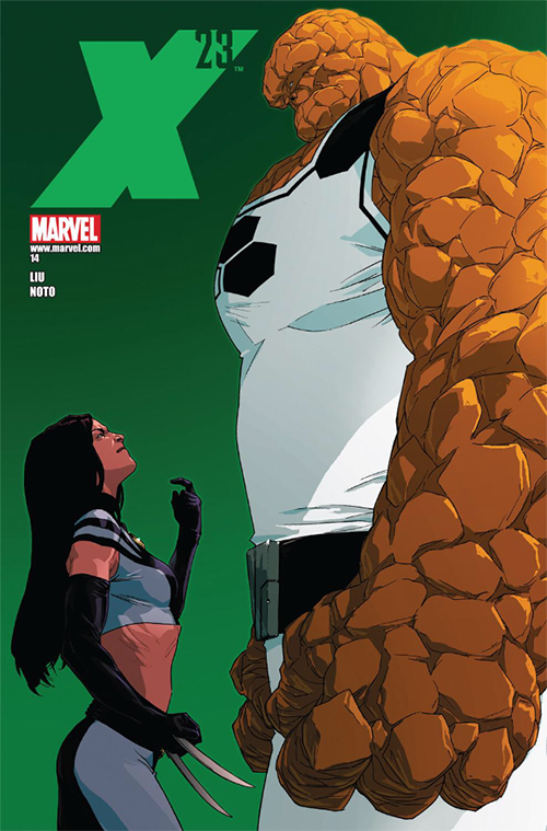
X-23 #14

ComiXology summary:
Guest-starring the FF and Spider-Man! A cosmic force is tearing apart New York, and targeting X-23, Sue Richards, and Spider-Man along the way. What strange connections do these three heroes share, and is it the key to saving the city and the world?

My wife is an intermittently glorious person. She fell asleep in X-Men: Days of Future Past… But at least she deigned to watch it with us. She stayed up for the entirety of Guardians of the Galaxy, at least, and was willing to discuss which Flores family member was which Guardian (despite other disputes we all agreed that Clark = Rocket).

Early on when we were dating I bought her a Brian Michael Bendis Ultimate Spider-Man trade for a Christmas present. “You said you liked the art!” I said, indicating that I had been paying attention to something she had said. Rather than being grateful for the expression of a skill that would dull over time, it turns out that she had just been making conversation during one of the interminable treks to the comic book store that she endured on my arm. This did not end up one of the best Christmas presents she had ever received.

Writes a hell of a True Detective recap, though 🙂

But years later, overhearing some nerd-conversation about Wolverine, she interrupted, “Oh! I like that one!”

I raised an eyebrow.

Why?

“He’s so handsome!”

In her mind “Wolverine” is a six-foot-two, manscaped Australian Broadway star.

Not, you know, a five-three hirsute Canadian animal-samurai.

It’s not her fault. She saw X2 in the theater with me!

Ask any X-fan in 2015 to conjure a mental image of Wolverine and they are likely to pick a similar path to my better half. Wolverine is no longer small and squat. He loses a bit of his maniac underdog quality; we lose quite a bit of scale.

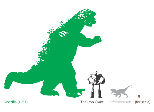
I am a sucker for scale.

We’ve had some really cool posts here on Fetchland over the first couple of weeks (I’m looking at you, Kitchen Table Gaming video), but my favorite thing so far is still the Jurassic World comparison chart I did in response to one of bdm’s “who’d win” questions:

Indominus rex

Why?

Scale.

Ultimately I think that is the main reason I like this X-23 cover by Kalman Andrasofszky cover so much… X-23 is just so much smaller than the Thing.

We think of any and all superheroes — especially combat-oriented ones like the daughter of Wolverine — to be physically invincible in some general sense. Fast, strong, tough, skilled, merciless… We lose the ability to differentiate in some morass of “well [s]he could kick _my_ ass”. Perhaps its fair insofar that Peter Parker could either out-box a normal man with Spider-Fu or break him with super strength; that Reed Richards could either deck one of us mere mortals from across the room or surround and suffocate with that body that flows like elemental water… And those are the geniuses! It is only when we pair some juggernaut against another that differentiation becomes interesting. Well maybe X-23 couldn’t really beat the Hulk, we might start… But she’s probably tough enough mentally to stand up to him.

I like scale differentiation because it is one of the few things that puts superhuman or de facto superhuman feats of violence into context. A “master swordsman” of impeccable deadliness from George R.R. Martin’s universe is still probably going to suffer in a one-on-one confrontation with a bear. Imagine the scale difference between a bear and one of Dany’s baby dragons. Now a baby dragon and a full-grown wurm of Middle Earth; finally a Smaug and a kaiju from Godzilla or Pacific Rim.

We suspend our disbelief to an unreal degree every time Daredevil knocks out a hallway full of gangster toughs. We nod in the faith that he will prevail against whatever threat the writers put against him. An Avenger, we simply accept his billy club would defend the entire seaboard from one of the aforementioned kaiju, if need be.

X-23, who in other contexts just falls into a general bucket of “she could kick my ass or any living, real, human” (a la Daredevil) looks positively miniscule against Ben Grimm.

I mean she is giving him a badass look, and I have no doubts that if push came to shove she would dive in with both feet (kung-fu kicking, no doubt) but the idea that at her weight she could do anything to move — let alone injure — that rocky mass seems laughable. I am not convinced that her claws could meaningfully penetrate his stone armor (even if she somehow mustered sufficient force behind a blow).

That’s the gift of Andrasofszky’s cover: a real, more-or-less good faith, comparison between two uber powerful combat-oriented superheroes. No matter whose name is sitting in the upper-left, I have little doubt of who would win, push comes to shove, claw comes to cosmically-irradiated dinosaur hide. This is a rare gift, and much appreciated experience.

The only thing that is weird to me is that they used Andrasofszky at all. Phil Noto is the interior artist of this issue of X-23; besides being a generally awesome artist, Noto is himself used to shine up other artists’ books with his inventively laid out and colorful colors. No complaint, really (like I said I love this one for the almost brutal honesty of the scale depiction), just a little puzzled.

LOVE
MIKE

Charlie's Angels

ComiXology Excerpt:
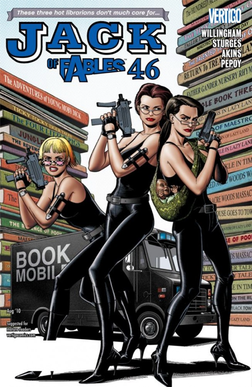
The Page Sisters finally find a new purpose in life: restoring the Great Library. And the one place you don’t want to be is between them and one of the books they want. Meanwhile, Jack Frost has just set upon the greatest quest in a long and distinguished career of great quests!

Jack of Fables 46

While technically a nicely illustrated cover (just clean execution by the inimitable Brian Bolland), “nicely illustrated” by itself doesn’t really cut it for our purposes. This is a cover capable of standing out… And for a not-blockbuster title like Jack of Fables, might really need to do so.

There are three things, I think, that make this a great and striking cover:

The first and most important is Bolland’s allusion to Charlie’s Angels. That is really the thing that had me give this cover a second look. The Page Sisters themselves are archetypically “the hot librarian” (it even says so, tongue-in-cheek, on the top-left). “Hot librarians” as described by TV Tropes are “very attractive, but prim and prudish” … “would be gorgeous if [they] would just take off the glasses / let down the hair”.

I’m sure that you have a general concept of what a “hot librarian” is trope-wise; it is a the mayhap-unexpected juxtaposition of attractiveness and restraint, or disinterest. On this Jack of Fables cover Bolland overlays the restraint of the “hot librarian” trope with maybe its polar opposite, in staging and body language. Here the librarians trade in their ballpoint pens for ballistics and channel the teeny bikinis of the 1970s jiggle procedural… Without actually letting down their hair, taking off the glasses, or for that matter revealing a lot of skin. Because the Charlie’s Angels logo was generally stylized in black, the Page sisters can go with a utilitarian spy / ninja black leather look (i.e. avoiding a full-bore Cheryl Ladd), allowing them to be consistent with Angel without betraying the fundamental conservatism of Librarian… But hey! Black leather!

It’s all overlaps and suggestion; the intended male viewer probably likes all of it without actually knowing which things he likes, or what exactly he is looking at; hinting at “over-the-top” while not being over-the-top itself. TLDR: Shockingly nuanced.

The second is all those titles on the giant books in the background. I don’t know if you took the time to read any of their titles but they say things like The Four Little Pigs or The Adventures of Young Moby Dick… That is, titles that are familiar but at the same time nonexistent. What kind of library do these woman run?!?

Finally, Bolland himself. The whole point of using a separate cover artist (especially if you’ve got a perfectly service-able interior artist) is to draw additional attention to your book. Brian Bolland is of course the celebrated genius executor behind (or rather, in front of) Alan Moore’s The Killing Joke, regarded by many to be the greatest Batman story of all time (if not YT). Bolland stacks visual technique on top of visual technique here like a layer cake: A big white chunk of negative space in the back, these sort of uniformly-boring imaginary books, a similarly-generic truck (with equally generic typeface), the Pages-by-way-of Angels in the foreground. I actually think the blah execution of everything behind the Page sisters is part of an intended look, allowing them (and their allusion to Aaron Spelling) to stand out more without having to resort to thick black lines, or, you know, a sledgehammer.

LOVE
MIKE

Batman Legends of the Dark Knight #18 by Jose Luis Garcia-Lopez

ComiXology excerpt:
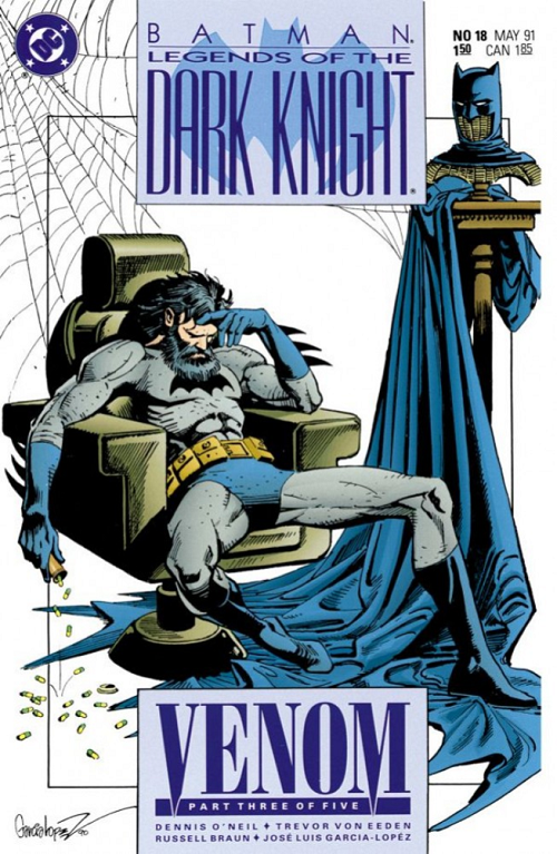
Batman’s fighting off the effects of the strength-enhancing drug, so he’s locked himself away in the Batcave and instructed Alfred not to open it–no matter what Alfred hears! Now, The Dark Knight faces the monstrous challenge of battling his own nightmares.

Desperate.

That is what I see when I look at this Jose Luis Garcia-Lopez cover.

Desperate. Pathetic. Wasted.

None of these are words that we typically associate with The Dark Knight.

By default we think of Batman as being confident, self-assured, and powerful. In the face of not just danger but near-certain death he holds his head up straight and stares enemies many times more powerful than he is straight in the eye… Right before spitting in it. Probably with kryptonite gum.

But what does Jose Luis Garcia-Lopez give us here?

Not just desperation; not just that unkempt mop and unshaven chin (neither being signals for “billionaire” or “playboy” for the cowl-less Caped Crusader); but a lazy slouch. Bruce in this shot is barely able to stay in his chair (let alone spit in the eye of an angry Kryptonian).

My longtime collaborator (and onetime comics editor) Brian David-Marshall loves to talk about comic book art as more storytelling than “mere” portraiture; and this cover does a great job of telling a story.

Why is Bruce falling out of his chair?

Why is Bruce out of control of his hair?

Mayhap he should have enrolled in D.A.R.E.

Do you see what is falling out of our hero’s hand?

Pills!

This is what comes of pills. Not even The Dark Knight is immune to their insidious effects. They can reduce a straight-backed superhero to a slouching scamp.

Neither will you, child, be able to walk away unaffected (if even you can still walk at all) (see not even Batman can).

Jose Luis Garcia-Lopez communicates a shocking amount of emotion into this image, layers upon layers of meaning, without a single speed-line. His story is not reliant on a single word balloon or stray line of detail. Through body language he can give Bruce’s ripped abs a sense of desiccation rather than core strength; and the same kinds of lines that typically communicate a lack of fat around the rib cage here seem more like a lack of oxygen or nourishment. Along with the shag and beard, Garcia-Lopez’s hands tell a tale (two tales actually): the left is warily weary but the right completely exhausted. Though we see essentially only two pieces of furniture (a pretty stock, if normally luxurious, captain’s chair and a pretty cool wicker cowl-perch), the non-furniture spiderwebs in the top-left give us a setting of disuse, even ruin. One of the sharpest, fittest, most on-the-ball billionaires in the DC universe — on top of every other negative emotion already communicated — is living, or at least sitting, in a zone of neglect; abandonment.

Overall, this is just a great cover. Technically it’s really well composed; I’m fine with the inks but it’s the combination of flat color and negative space that really do it for me. I’m just such a sucker for flat color.

In case you’re wondering what you’re reading, this is Superficial Saturdays — a column I am carrying over from my original blog Five With Flores — that talks about comics covers (as in “superficially” judging a book by its cover), you know, on Saturdays. If you liked this, you can check out the previous sixteen installments over at Five With Flores.

I do hope you liked this! Thanks for checking our comics content out here at Fetchland.

LOVE
MIKE