

Superficial Saturdays #18 – Jack of Fables #46
Posted by Michael Flores | ComicsComiXology Excerpt:
The Page Sisters finally find a new purpose in life: restoring the Great Library. And the one place you don’t want to be is between them and one of the books they want. Meanwhile, Jack Frost has just set upon the greatest quest in a long and distinguished career of great quests!
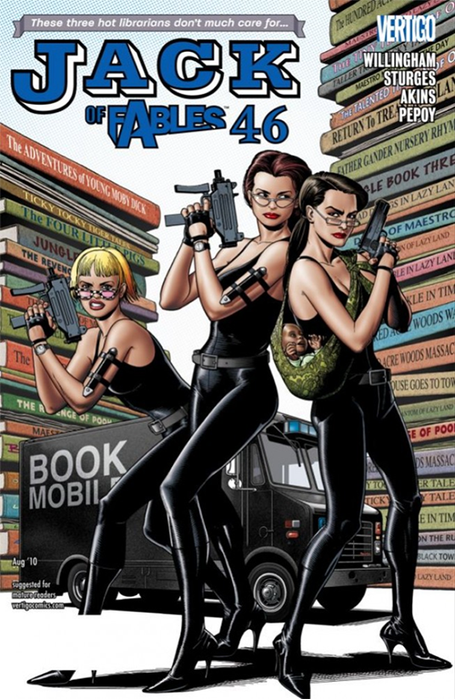
While technically a nicely illustrated cover (just clean execution by the inimitable Brian Bolland), “nicely illustrated” by itself doesn’t really cut it for our purposes. This is a cover capable of standing out… And for a not-blockbuster title like Jack of Fables, might really need to do so.
There are three things, I think, that make this a great and striking cover:
The first and most important is Bolland’s allusion to Charlie’s Angels. That is really the thing that had me give this cover a second look. The Page Sisters themselves are archetypically “the hot librarian” (it even says so, tongue-in-cheek, on the top-left). “Hot librarians” as described by TV Tropes are “very attractive, but prim and prudish” … “would be gorgeous if [they] would just take off the glasses / let down the hair”.
I’m sure that you have a general concept of what a “hot librarian” is trope-wise; it is a the mayhap-unexpected juxtaposition of attractiveness and restraint, or disinterest. On this Jack of Fables cover Bolland overlays the restraint of the “hot librarian” trope with maybe its polar opposite, in staging and body language. Here the librarians trade in their ballpoint pens for ballistics and channel the teeny bikinis of the 1970s jiggle procedural… Without actually letting down their hair, taking off the glasses, or for that matter revealing a lot of skin. Because the Charlie’s Angels logo was generally stylized in black, the Page sisters can go with a utilitarian spy / ninja black leather look (i.e. avoiding a full-bore Cheryl Ladd), allowing them to be consistent with Angel without betraying the fundamental conservatism of Librarian… But hey! Black leather!
It’s all overlaps and suggestion; the intended male viewer probably likes all of it without actually knowing which things he likes, or what exactly he is looking at; hinting at “over-the-top” while not being over-the-top itself. TLDR: Shockingly nuanced.
The second is all those titles on the giant books in the background. I don’t know if you took the time to read any of their titles but they say things like The Four Little Pigs or The Adventures of Young Moby Dick… That is, titles that are familiar but at the same time nonexistent. What kind of library do these woman run?!?
Finally, Bolland himself. The whole point of using a separate cover artist (especially if you’ve got a perfectly service-able interior artist) is to draw additional attention to your book. Brian Bolland is of course the celebrated genius executor behind (or rather, in front of) Alan Moore’s The Killing Joke, regarded by many to be the greatest Batman story of all time (if not YT). Bolland stacks visual technique on top of visual technique here like a layer cake: A big white chunk of negative space in the back, these sort of uniformly-boring imaginary books, a similarly-generic truck (with equally generic typeface), the Pages-by-way-of Angels in the foreground. I actually think the blah execution of everything behind the Page sisters is part of an intended look, allowing them (and their allusion to Aaron Spelling) to stand out more without having to resort to thick black lines, or, you know, a sledgehammer.
LOVE
MIKE