Codename: Action #1

comiXology summary:
Codename: Action #1. During the height of the Cold War, unknown forces scheme to heat up a global conflict. As key officials on both sides of the Iron Curtain are replaced with doppelgangers, the infiltration threatens to disrupt the precarious state of world affairs. The security of the Free World depends on a young secret agent, one assigned to shape the world’s masked heroes into a force with singular purpose and unyielding resolve!

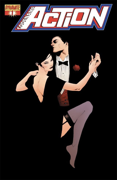
I actually don’t know anything about Codename: Action as a title-title. I saw a solicitation announcement for it reading another Dynamite comic and thought this was a cool looking cover. (And hope you’ll agree.) What I do know is that this Codename: Action #1 cover by Jae Lee is a masterwork of elegant design and the use of negative space.

On Jae Lee…

Jae Lee, Jae Lee… What can I say about Jae Lee?

Lee hit my eyes and imagination in the early 1990s. I loved his work on a now-defunct WildC.A.T.S. title (“filling in” for a different J. Lee if you grok). In those pre-Internet days, I had to ask actual humans at the counter where I could find more Jae Lee. I bought all of it, and combed every local comics store to assemble his Namor work. I’m not sure if he was my “favorite” comics artist (or even my favorite “Lee”), but I do remember that when I was writing down my goals for a high school illustration class, I dropped his name as a role model.

Lee is one of the most distinctive artists on the planet, which is why he is so often tapped as a cover artist, more than an interior artist. He’s not the most facile storyteller, but his line work is unparalleled in its intention and precision. Part of being, there are so few lines.

I mean, there are probably fewer total lines on this Codename: Action #1 cover than the average square inch of the average Rob Liefeld! Any doofus can put a giant splotch of black on a panel or flood the gutters, but for my $1.99 almost no one touches Jae in terms of making something as 75% black as this look actually delicate.

And that foot!

It probably isn’t a surprise to you that BDM and I have bumped heads more than once over the years RE: what makes a good comics artist, or even just a good artist. As striking as his portraiture has always been, Lee has drawn criticism over his ability on hands and feet.

Personally, I love the interplay between the dancers’ hands… The combination of her consistently implied details versus the strategic line overload of his palm.

I wonder what BDM thinks of that foot. There is no mist rising up covering it; both the dancers have actual hands (and not claws).

But even if it were just claws / mist… It’d probably still look great from across a comics store.

LOVE
MIKE

Batman #47

comiXology summary:
Batman #47. While Jim Gordon is in the fight of his life against Mr. Bloom, Bruce Wayne discovers a shocking secret about his past that will change everything in Gotham City!

This Alex Ross cover was actually an alternate for a relatively recent* issue of Batman. Because it wasn’t the main cover I wouldn’t consider Batman #47 a “bait and switch” on characters in the same way I criticized All-New Inhumans. This is beside the fact that Batman isn’t even Batman in this issue (a moustache-less Jim Gordon was filling in for an amnesiac Bruce Wayne at the time).

But what makes this a noteworthy cover? I mean, there are alternate covers to some book or other essentially every week, right?

The first reason is just that this is an Alex Ross, and any mainstream Alex Ross is probably worth a second look, even if we don’t end up lingering on it. That’s not the real reason, though; at least not for me.

This Batman #47 alternate, with it’s “Harley’s Little Black Book” titling, is a sequel of sorts. One of the best — or at least most famous — depictions of Harley Quinn was done by Ross back in 1999 for Batman: Harley Quinn #1. Though Harley’s entire character arc had essentially been played out between her first appearance on Batman: The Animated Series in 1992 and its last episode (months earlier in 1999) she had never — never — appeared in a mainstream DC Universe comic before Batman: Harley Quinn #1!

So bringing Harley (who would ultimately become one of DC’s most famous and popular characters) to comics was kind of a big deal. DC tapped Ross for this classic:

Batman: Harley Quinn #1

When I first started working, and first figured out how to change the desktop background on my PC, this is what I chose.

So what did I love about Batman #47? Check the white flower over Mr. J’s left breast; the tux… all of it. This is the direct sequel to the classic.

LOVE
MIKE

* “Relatively recent” being about Christmas last year, given a stated print release date of December 9, 2015. With DC’s “Rebirth” event Batman has since been renumbered at #1 under The Vision scribe Tom King.

All-New Inhumans #9

comiXology summary:
All-New Inhumans #9. Gorgon stands trial! What crime could Gorgon have committed to land him in an Inhuman jail? And what does Ana Kravinoff have to do with it all?

The bait and switch 🙁

Last night at FNM (writeup coming to a Fetchland near you) I saw this week’s cover… All-New Inhumans #9.

Look at that cover for a second. Quick-like; like you were passing it on a comic shop rack, mayhap on the way to your second round of Standard. Note this is a Marvel comics cover. Seriously: What character do you see?

Wolverine, right?

I immediately moved to the rack. I thought Wolverine was dead* in Marvel Comics**.

I mean, I wasn’t necessarily going to jump into All-New Inhumans with the ninth issue, but I did want to know what was up with Wolvie. Curiosity, you grok?

How could it be anyone else?

I mean, the cover is an obvious homage to the various Marvel Comics Presents covers that Barry Windsor-Smith did in the early 1990s. There are many, but this seems like the most direct inspiration:

Marvel Comics Presents #78
Barry Windsor-Smith’s cover to Marvel Comics Presents #78

No beef with cover artist Stefano Caselli; seriously… But that All-New Inhumans cover sure smells like a lift homage to BWS’s classic, doesn’t it?

TLDR: IT’S NOT WOLVERINE ON THE COVER.

Per the ComiXology summary, it’s Inhuman Gorgon on the cover; I guess you would know that if you were a regular reader of All-New Inhumans… But as a comics cover (i.e. something that is meant to draw in potential readers who are not regular subscribers of a comic on a monthly basis) I didn’t know it was Gorgon. I thought maybe I’d get the DL on a once-central character who has been dealt a really raw hand in the comics universe [that in other circumstances would have grown right back].

Boo, All-New Inhumans #9 cover!

Boo… And well played.

LOVE
MIKE

* Except for Old Man Logan; another time.
** Wolverine being Marvel’s more-or-less most popular character… Whose film rights are owned by someone else.

Animal Man #6

comiXology summary:
Buddy Baker must face off against invading Thanagarians looking to conquer Earth! Can Buddy Baker stand up to the winged wonders or will he become the first casualty of war? Grant Morrison’s ANIMAL MAN epic continues!

In the new episode of Top 8 Magic (that comes out next week, actually) BDM and I talk about DC’s Legends of Tomorrow and the Dwayne McDuffie-driven Justice League and Justice League: Unlimited cartoons. Hawkgirl (or Hawkwoman) in some of her various incarnations is a central cast member of all those teevee shows.

That said, the woman swinging the Nth Metal Morningstar at Buddy Baker in this week’s Superficial Saturdays cover is not actually Hawkgirl, rather a Thanagarian soldier name of Kol (not Hol, or “Hall”)… But I doubt the marketing department or cover editor would have minded much character confusion… Any more than they would the shamelessness of that Thanagarian uniform.

You see, Animal Man — though considered the apex of Grant Morrison’s writing career by some critics — was not exactly a hot seller. As good as the story is considered — and as well as it is thought to hold up over two or even three decades now — interiors penciler Chas Truog is widely panned as the weakest artist Morrison was ever paired with on a regular book.

No problem for Superficial Saturdays fans, though! Brian Bolland handled covers for going on three years (this is, of course, not the first time Bolland has been the subject of Superficial Saturdays).

Lots of stuff I love about this one:

  • It’s nakedly eye-catching; Thanagarian uniform and everything else.
  • Bolland’s line work is impeccable, as usual. Check out the delta between foreground and background wings, the precision on the Nth Metal Morningstar spikes, and Buddy’s jacket… especially in contrast to the shadow across his right leg
  • The colors, circa three years before the garish explosion of “computer coloring” onto the industry, is subtle. Not perfect by any means, but subtle. One thing to keep in mind is that with 1980s level of coloring technology a penciler (or penciler / inker like Bolland) had to be way more skilled to look not nearly as good. Bolland accomodates, per usual.

To the surprise of no one, Brian Bolland won 1992’s inaugural Eisner Award for Best Cover Artist, largely due to his work on Animal Man.

LOVE
MIKE

Starman #33 by Tony Harris

comiXology summary:
Starman #33. Solomon Grundy lies dying and now Jack Knight, Batman, Sentinel, and the Floronic Man must band together to save the reformed criminal. However, to save the pale giant, they must face past incarnations of Grundy, all of which are evil to the core.

Okay story time RE: Starman #33:

It’s probably about 1997. Starman is one of my two favorite comic books that come out every month (along with Preacher; and they typically come out the same day). Haven’t heard of Starman? I’m not particularly surprised. Jack Knight is the son of Golden Age hero [also] Starman, and Starman is the story of Jack taking up the superhero business after his brother David (interim Starman between daddy and Jack) is killed. Jack doesn’t really want to be a superhero. He runs a second-hand shop and mostly gets tattoos. To give you an idea about a typical story, at one point his second-hand shop is attacked by a maniacal villain-to-be as Jack unwittingly has a Hawaiian shirt that is a magical teleportation portal in inventory.

The battle is resolved by, um, Jack selling the would-be villain the shirt.

Starman was offbeat and heartwarming. Sure there was violence, sacrifice, murder, and even galaxy-spanning space adventure, but it was a largely a comic book of small stories, albeit perfectly executed by James Robinson (who would later execute Sean Connery’s movie career as the screenwriter for LXG) and Tony Harris (Harris would later become my favorite active comic book artist). Today’s Starman #33 cover is of course by Harris.

So here’s the story:

In the mid-1990s comics were in a very different spot than they are today, fueled as they are by billion dollar blockbuster films coming out of Marvel Studios. The entire industry was coming down off of the 1992 bubble boom driven by the breaking of the Bat, the Death of Superman, and infinite chromium variant covers coming out of Image and Valiant. The nostalgia wave would not hit for another five years, and Iron-Man for another maybe eight after that. Comics for comics sake were in a precarious position, and telling small — if great — stories about a second-hand store salesman and his ex-superhero pops needed *ahem* some sales if they wanted to stay buoyed at studio like DC.

How do you bolster sales?

Look at that g-d cover.

Notice anyone standing behind ole tattoo’d Jack?

Starman #33 sold out basically everywhere.

That’s great, right?

Um… The average comic book store ordered like two copies of Starman every month. Some people — like yours truly — were the avid and loyal readers of this aforementioned title Starman. And these Batman fans bought up all our copies!

Even my friend Brian K. Vaughan — who had never read Starman once in his life — bought a copy of #33 (which I’m guessing even twenty years later he never even read). “What can I say? I buy any book with Batman on it.”

It took me maybe four months to hunt down a copy of Starman #33 to even out my collection. This was super shitty because the next issue was the beginning of a new story arc; also because Batman — who had been written as maximally grumpy while visiting Opal City — finally cracked a smile and revealed his favorite Woody Allen movie (Crimes and Misdemeanors, natch).

So if the definition of great comics cover is to sell more comic books — especially by attracting readers who wouldn’t normally pick up your title — there is no better exemplar than Starman #33.

LOVE
MIKE

The Batman Adventures #7

comiXology summary:
A new mobster enters Gotham City looking to make it big. But when Batman tracks this fugitive from Chicago underground, he encounters something else lurking in the depths: Killer Croc!

So Suicide Squad came out yesterday.

I haven’t seen it yet, but I know one thing… It’s got Killer Croc!

See?

Killer Croc

Poor Croc. Is he a super human freak? A regular fellow with an unfortunate skin condition? A cannibal? A pretty nice guy who happens to live in the sewers? “Throw a rock at him [Batman] once”? In the comics and cartoons he’s been variations on lots of those things; but what crime did Croc commit to make it into Amanda Waller’s eponymous ‘Squad?

I don’t know either.

But they sure made him bumpy for the movie.

Anyway, in honor of the movie opening (featuring Croc) I decided to peel back the veils of years to a 1993 cover by Kelsey Shannon. 1993! I was in high school! Taylor Swift was four! Killer Croc was strangling the World’s Greatest Detective on the cover of The Batman Adventures #7!

I love this cover.

It is so g-d unpretentious.

Has Croc got scales? Not on the cover of The Batman Adventures #7 he doesn’t (explicitly). Shannon kind of lets you use your imagination on this one. Croc certainly has bumps on the top of his head; and the name “Croc” probably signals you that he is kind of lizard-y, skin-wise. Certainly his coloration is unusual.

The “acting” on this cover is also great.

I am so So SO a fan of form over detail. Shannon used minimal lines on this image. There are probably fewer lines on the entirety of The Batman Adventures #7’s cover than are contained in one square inch of the average Rob Liefeld pinup. But it doesn’t matter! With minimal lines Shannon is able to deliver so much drama.

We know Croc is strong. How can we know without infinitely rendered pectoral-deltoid-rectuses? Because of the pose, the angle on Batman, the implied bulge of tendons across Croc’s forearm.

We know Batman is desperate. How can we know without a bunch of narrating first-person word balloons? Because his teeth are grinding together, and his face is being compressed, and he is futilely trying to pry that left Croc-arm from around his esophagus.

The color is mostly flat. It’s not exactly flat; there are some gradations and implied shadows… But it’s pretty flat. I am a fan of flat color over “computer coloring” (or at least the look of what was called computer coloring in the early 1990s)… I point it out here because in 1993 it would have been really easy to fall into the garish trend coming out of Image and the X-Men books; but Shannon didn’t.

We thank you.

Batman thanks you.

And 23 years later, so does an immortal Killer Croc.

LOVE
MIKE

comiXology summary:
It’s a cosmic calamity as Rocket tries to fix his past… er… bad calls! Next stop, the dreaded Winter Planet! Winter all the time? Worst. Planet. Ever. Rocket Raccoon rockets into our hearts with the series beloved by Marvel fans everywhere!

There are multiple schools of thought around what makes a good cover. BDM likes a cover to tell a story. He is fine with word balloons all over it. I think that is his idea of good comics art bleeding into an idea of what makes good comics cover art.

For my part, I see the cover as the last refuge of portraiture in comics; static images; doesn’t necessarily have to tell a story… Fine if it just looks cool.

That said, I — and you probably know this if you know anything about my biases in Magic deck design — tend to be positively inclined to things that are different. Different-good better than “different for difference’s sake” but still willing to entertain a conversation around just different, especially if it pushes the design envelope.

Rocket Raccoon #7 brings together a lot of these threads and ideas.

For BDM… It kind of tells a story. Look at that image for a second. What do you see? “‘Rocket Raccoon in a snowstorm’ for $500, Alex.” Yes? Yes. Yes of course. Guess what happens in the comic?

What’s really cool in my mind is how minimally Skottie Young is able to accomplish all this. He uses, what? One color? That kind of teal? Not only that, but he incorporates the same design limitation to the Rocket Raccoon trade dress, and moves it from the typical top to make sense, almost as part of the cover’s landscape. Different; pushes the design elements; and a bit of story:
Rocket Raccoon #7 gives us an unassuming little cover (that happened to be on one of the most popular comics in the known universe Galaxy).

LOVE
MIKE

Mortal Kombat X #26

comiXology summary:
Mileena vs. Skarlet! Reiko vs. Kotal Kahn! The brawl for it all continues as a surprise new character joins the fray!

I’m a sucker.

I’m a sucker for a bunch of things.

I’m a sucker for a bunch of things in the same way that BDM has 15 or so movies in his “top 5” favorite movies.

Things I am a sucker for:

Juxtaposition – If you put unlike things together in an artful or internally-logical / consistent way, I will like it (or at least you will get points for it). Here we have a character that is 95% super sexy [and meant to be gazed on that way]… Trim figure, barely-there top, shiny leather pants… But, oh yeah, monster mouth. Ew. Gross. Yet…

Surprise! – I was always more of a Street Fighter guy as a kid than a Mortal Kombat guy, but I played some Mortal Kombat; sure. Back twenty or so years ago when these characters were first coming out, Mileena was more-or-less a sprite of 1-2 other ninja girls, except she had a sash over her mouth. The sash was — gasp — to cover up her gross monster mouth. This was only to be revealed via Special Move ™. Surprise! Now a couple of decades in, Mortal Kombat-consuming audiences know about her monster mouth and she is not even wearing any cover-up here. So the surprise is in the slavish depiction of her opposite number on the cover. He sees that she is a monster (not just some slim-if-deadly ninja doll). But he is still mesmerized, on his knees. Surprise!

Jae Lee – When I took an art class at age 17, on the first day the instructor gave us a questionnaire about what we wanted to learn / accomplish in that art class. I vividly remember writing some approximation of “to learn to draw like Jae Lee” on mine (which was probably horrifying to the instructor, who though American, changed both his first and last names to the French approximations, accent marks and all). I recounted that story to BDM some time in the ensuing twenty years and he remarked “I take it learning to draw feet was not high on your list” … Hmmm, awesome cover or no, Jae did not make with the feet here, did he?

This is a digital comics cover; and while I am not a regular consumer of Mortal Kombat X, my take is that it is the cover for both #26 and #27; it had me doing a double-take, which is saying something given it was a tiny icon on a browse page and not even a real magazine on a real newsstand. Like I said, I’m not the usual audience, but I not only clicked, but upon recognition of a style, I clicked and further clicked to confirm that it was in fact a Jae Lee… Up to and including writing up this piece.

From a style standpoint (and this might go back into the “juxtaposition” section) it really got me thinking about how Lee broadened his execution here. The Mileena figure on the left is pretty classic Lee. Sharp lines, very graphic use of blacks for outline, accent, and deep, opaque spaces that can be interpreted either as shadow or color (black). But on the right, the opposite character is finished in a very different way. Note the ink work on his headdress… That’s very “brush” rather than “pen”. Ditto on his musculature. Notice how she is all smooth and he is all feathery muscle-wise? While I would not go so far as to say the figures are from two different pieces, they seem quite differently-finished to me. I don’t know that that is a weakness (I think the piece overall is plenty striking and effective), I do think that it is pleasantly noggin-scratching for those of us who kind of stared at this cover for half an hour. Mayhap Lee is stretching his skills a little, in a way that most audiences might not even notice; he manages to do his usual thing while still channeling a mote of Alex Raymond (perhaps for future invocation).

Either way, looks cool.

LOVE
MIKE

Years of Future Past #3

comiXology Summary:
Gouged up from its sanctuary, the mutants’ last defender clashes with Sentinels above the ruins of New York City! Kate Pryde and her family take refuge in a Coney Island madhouse, and find dark revelations at last!

Kind of a weird Superficial Saturdays on this one (yes, besides being published on, you know, a Sunday)…

Brian David-Marshall (bdm) and I were standing around together between rounds at Friday Night Magic last week; my first Friday Night Magic ever, if truth be told, and we were going over all the new comics on the shelves. I was making a note on how basically all the currently printed Marvel Comics are marked as “Battleworld” or “Secret Wars” in a storyline somewhat reminiscent of DC’s Crisis on Infinite Earths. We leafed through covers and pointed out the logos, and Brian noted how the current event is also resurrecting successful or at least iconic story lines of Marvel past, like Future Imperfect, Inferno, or the crossover concept of Secret Wars itself.

Which brought us to Years of Future Past #3.

“This cover is awesome! If anything is a Superficial Saturdays, this is,” ordered Brian. “I am not really into reading comics right now, but if anything was going to pull me from the gaming tables to the comics shelves it would be this cover.”

Let’s take a look at Years of Future Past #3 and check for some of the things Brian is talking about…

First of all, in the top-right corner, is a comic that is [something] about “Future Past”. You don’t need to be a die-hard comics reader to know that “Future Past” is a reference to an X-Men story featuring Sentinels because there was a great movie on the same topic last summer. But generally speaking, yes… Days of Future Past was a 1980s X-Men story that is very highly regarded; generally considered either #1 or #2 in the iconic Chris Claremont / John Byrne collaboration (depending on how much you like The Dark Phoenix Saga).

Interestingly Brian noted that he thought the cover was an Arthur Adams. It is in fact an Arthur Adams. Art Adams is one of those artists whose work is almost unmistakable once you’re any kind of familiar with it. I’d guess it has been twenty or even thirty years since Brian has read an Arthur Adams X-Men book… But he was still able to pick one off the stands from several paces. Art Adams is an interesting choice for cover artist here… Adams was one of the hottest, most hyped X-Men artists of the 1980s, but didn’t really contribute a huge number of issues or sustain a run on Uncanny X-Men in the same way that other giants of the era like Marc Silvestri, Jim Lee, or of course John Byrne did. Adams was mostly responsible (or co-responsible) for bringing Longshot into the X-Men family via Limited Series and a couple of annuals that constituted the Asgardian Wars (a de-powered Storm flirts with regaining her weather control powers by getting a Thor-esque hammer, stuff like that). Yet Adams is an iconic 1980s X-Men artist in the minds of many readers, and the Years of Future Past editors are keying in on that with their choice here.

“That is Lockheed burning down a Sentinel!”

Brian was quite excited about this last point. I am not actually sure that that is Lockheed, Kitty Pryde’s pet purple dragon, as it is a gigantic dragon and Lockheed can sit on your shoulder… But it certainly looks like a giant Lockheed! Days of Future Past was Kitty’s story, and Lockheed is Kitty’s dragon, at least. Lots of fanboy heart-tugging seeing a beloved, typically-little guy incinerating the symbol of Mutant oppression, especially on equal footing.

From an illustration standpoint, I can’t disagree with Brian’s assessment of “awesome”. Adams does a great job with foreground and background detail here, actually making the foreground characters less detailed, shadowed by the illumination of Lockheed’s fire breath. I am usually a “flat color > ‘computer’ coloring” [I know, I know, “everything” is computer coloring], but I am a sucker for making lights look super bright on a page, and the colorist did an amazing job making Adams’s line work appear like molten metal here. Absolutely A+ on that front. Moreover, the shadow / scales / light source detail on Lockheed himself shows tremendous attention to detail.

But most important was Brian’s assertion that he would walk over and pick up this comic if we hadn’t already been chatting about them. When you choose a cover artist, especially one that is different from a talented interior artist (like Mike Norton on this book), it has to be to get people to give your book a chance. This one passed that test with flying colors — purple and gold, to be exact.

LOVE
MIKE

The Mighty Thor #39

ComiXology Summary:
While Thor and Jake have their wounds tended to by Asgardian healers, Odin and Balder discuss the fate of the Destroyer. Will Odin finally end the dark legacy of the Destroyer Armor?

Jake?

Odin?

Balder?

The Destroyer [Armor]?

I don’t know about you but I don’t see any of these cats or any of that jazz on this cover.

To me, this is a pretty non-specific cover that could have been slapped on any number of issues of The Mighty Thor… But just so happens to be on #39-slash-#541.

Non-specific or not — in terms of subject matter and execution — this cover is pretty specifically awesome, and showcases a lot of what makes Barry Windsor-Smith such a revered illustrator.

A lot of guys doing comics just want to do comics; they lack drawing fundamentals which they make up for (somewhat) with tons of lines, extra muscles, skimping on feet, and endless teeth. On the other hand you have an artist like Barry Windsor-Smith; a REAL ARTIST (all in caps) who happens to be putting a superhero on a piece of paper.

I find his decisions really thought provoking… Essentially no background; but a weird off-center figure layout. A mix of really fine lines around the thighs and boots with these thick, cartoon-y strokes around everywhere else. The ink quality looks really “wet” and confidently loose, without sacrificing an air of precision. Windsor-Smith cheats with the inks, though. To my mind there is little if any finishing differentiation between Thor’s skin, his leggings and his hammer / helmet. Now obviously his helmet is metal, but it is is Mjolnir that gets the more dramatic metallic lighting effect (funny, I “know” Mjolnir is Uru, but I usually “read” it as stone when looking at a Thor picture). Then we have these totally random horizontal slashes across the white circle-thing on Thor’s right pectoral (I’ve always read those as stylized metal discs on leather armor, which would make the particular execution of these slashes completely illogical).

The only things that get a different ink finishing quality are Thor’s wrist straps and boots (which are both “cloth”).

But I don’t care. This cover ultimately works, and I love how the line work comes out, differentiation or no (especially on Thor’s flowing golden locks). The visual figurative language here reads classic funnybook but Windsor-Smith elevates it with his Renaissance-influenced compositional capabilities. I generally find “blatantly obvious Photoshop filters coloring” garish but there is so much negative space (BWS feels no need to cover up bad form with endless speed lines and cross hatching) the colors work just fine; besides which, I doubt he colored it himself.

Finally — and this is a “fellow artist” thing that I wouldn’t expect most folks to pick up on, but one that I get a kick out of — note Barry Windsor-Smith’s signature, “BWS”. He signs in white ink right under Thor’s cape on the right side of the image. “BWS” has another meaning for comics illustrators… “black with stars”. As onetime comics editor BDM taught me during the first Comic Book Idol, “BWS” is shorthand for pencilers to indicate generic nighttime sky finishes to their inkers. Here BWS’s “BWS” is a tongue-in-cheek background instruction as well as signature.

Super fun, super well-executed, cover that works from one of the genre’s finest talents. I would definitely have picked this book up to look at if I saw it on the stands, and I probably would have stuck around for Stuart Immonen when I did. Good choices all around.

LOVE
MIKE