


comiXology Summary:
Gouged up from its sanctuary, the mutants’ last defender clashes with Sentinels above the ruins of New York City! Kate Pryde and her family take refuge in a Coney Island madhouse, and find dark revelations at last!
Kind of a weird Superficial Saturdays on this one (yes, besides being published on, you know, a Sunday)…
Brian David-Marshall (bdm) and I were standing around together between rounds at Friday Night Magic last week; my first Friday Night Magic ever, if truth be told, and we were going over all the new comics on the shelves. I was making a note on how basically all the currently printed Marvel Comics are marked as “Battleworld” or “Secret Wars” in a storyline somewhat reminiscent of DC’s Crisis on Infinite Earths. We leafed through covers and pointed out the logos, and Brian noted how the current event is also resurrecting successful or at least iconic story lines of Marvel past, like Future Imperfect, Inferno, or the crossover concept of Secret Wars itself.
Which brought us to Years of Future Past #3.
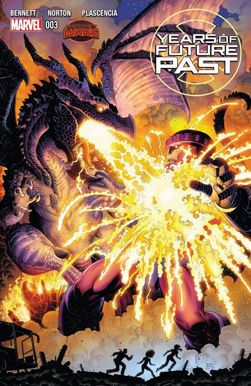
“This cover is awesome! If anything is a Superficial Saturdays, this is,” ordered Brian. “I am not really into reading comics right now, but if anything was going to pull me from the gaming tables to the comics shelves it would be this cover.”
Let’s take a look at Years of Future Past #3 and check for some of the things Brian is talking about…
First of all, in the top-right corner, is a comic that is [something] about “Future Past”. You don’t need to be a die-hard comics reader to know that “Future Past” is a reference to an X-Men story featuring Sentinels because there was a great movie on the same topic last summer. But generally speaking, yes… Days of Future Past was a 1980s X-Men story that is very highly regarded; generally considered either #1 or #2 in the iconic Chris Claremont / John Byrne collaboration (depending on how much you like The Dark Phoenix Saga).
Interestingly Brian noted that he thought the cover was an Arthur Adams. It is in fact an Arthur Adams. Art Adams is one of those artists whose work is almost unmistakable once you’re any kind of familiar with it. I’d guess it has been twenty or even thirty years since Brian has read an Arthur Adams X-Men book… But he was still able to pick one off the stands from several paces. Art Adams is an interesting choice for cover artist here… Adams was one of the hottest, most hyped X-Men artists of the 1980s, but didn’t really contribute a huge number of issues or sustain a run on Uncanny X-Men in the same way that other giants of the era like Marc Silvestri, Jim Lee, or of course John Byrne did. Adams was mostly responsible (or co-responsible) for bringing Longshot into the X-Men family via Limited Series and a couple of annuals that constituted the Asgardian Wars (a de-powered Storm flirts with regaining her weather control powers by getting a Thor-esque hammer, stuff like that). Yet Adams is an iconic 1980s X-Men artist in the minds of many readers, and the Years of Future Past editors are keying in on that with their choice here.
“That is Lockheed burning down a Sentinel!”
Brian was quite excited about this last point. I am not actually sure that that is Lockheed, Kitty Pryde’s pet purple dragon, as it is a gigantic dragon and Lockheed can sit on your shoulder… But it certainly looks like a giant Lockheed! Days of Future Past was Kitty’s story, and Lockheed is Kitty’s dragon, at least. Lots of fanboy heart-tugging seeing a beloved, typically-little guy incinerating the symbol of Mutant oppression, especially on equal footing.
From an illustration standpoint, I can’t disagree with Brian’s assessment of “awesome”. Adams does a great job with foreground and background detail here, actually making the foreground characters less detailed, shadowed by the illumination of Lockheed’s fire breath. I am usually a “flat color > ‘computer’ coloring” [I know, I know, “everything” is computer coloring], but I am a sucker for making lights look super bright on a page, and the colorist did an amazing job making Adams’s line work appear like molten metal here. Absolutely A+ on that front. Moreover, the shadow / scales / light source detail on Lockheed himself shows tremendous attention to detail.
But most important was Brian’s assertion that he would walk over and pick up this comic if we hadn’t already been chatting about them. When you choose a cover artist, especially one that is different from a talented interior artist (like Mike Norton on this book), it has to be to get people to give your book a chance. This one passed that test with flying colors — purple and gold, to be exact.
LOVE
MIKE