comiXology summary:
It’s a cosmic calamity as Rocket tries to fix his past… er… bad calls! Next stop, the dreaded Winter Planet! Winter all the time? Worst. Planet. Ever. Rocket Raccoon rockets into our hearts with the series beloved by Marvel fans everywhere!
There are multiple schools of thought around what makes a good cover. BDM likes a cover to tell a story. He is fine with word balloons all over it. I think that is his idea of good comics art bleeding into an idea of what makes good comics cover art.
For my part, I see the cover as the last refuge of portraiture in comics; static images; doesn’t necessarily have to tell a story… Fine if it just looks cool.
That said, I — and you probably know this if you know anything about my biases in Magic deck design — tend to be positively inclined to things that are different. Different-good better than “different for difference’s sake” but still willing to entertain a conversation around just different, especially if it pushes the design envelope.
Rocket Raccoon #7 brings together a lot of these threads and ideas.
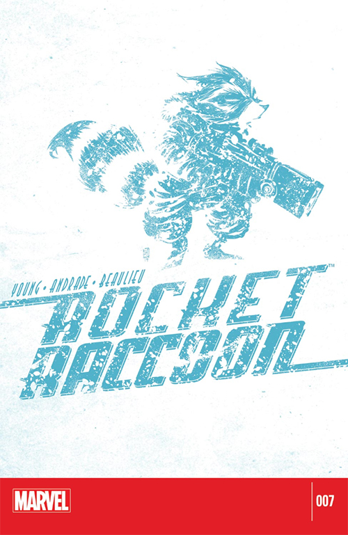
For BDM… It kind of tells a story. Look at that image for a second. What do you see? “‘Rocket Raccoon in a snowstorm’ for $500, Alex.” Yes? Yes. Yes of course. Guess what happens in the comic?
What’s really cool in my mind is how minimally Skottie Young is able to accomplish all this. He uses, what? One color? That kind of teal? Not only that, but he incorporates the same design limitation to the Rocket Raccoon trade dress, and moves it from the typical top to make sense, almost as part of the cover’s landscape. Different; pushes the design elements; and a bit of story:
Rocket Raccoon #7 gives us an unassuming little cover (that happened to be on one of the most popular comics in the known universe Galaxy).
LOVE
MIKE


